// case study - events app - mobile
Third - for Huspy
An events app for people who go out with friends.
Built around who’s going, not just what’s on: invites first, clear plans, and a friend’s spare ticket or the waitlist when it sells out.
October 2026 - design challenge for Huspy - solo - research, flows, UI, prototype
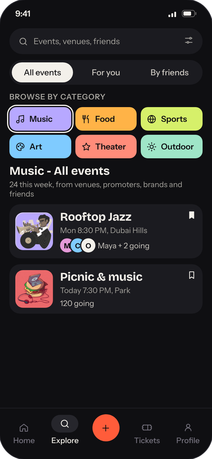
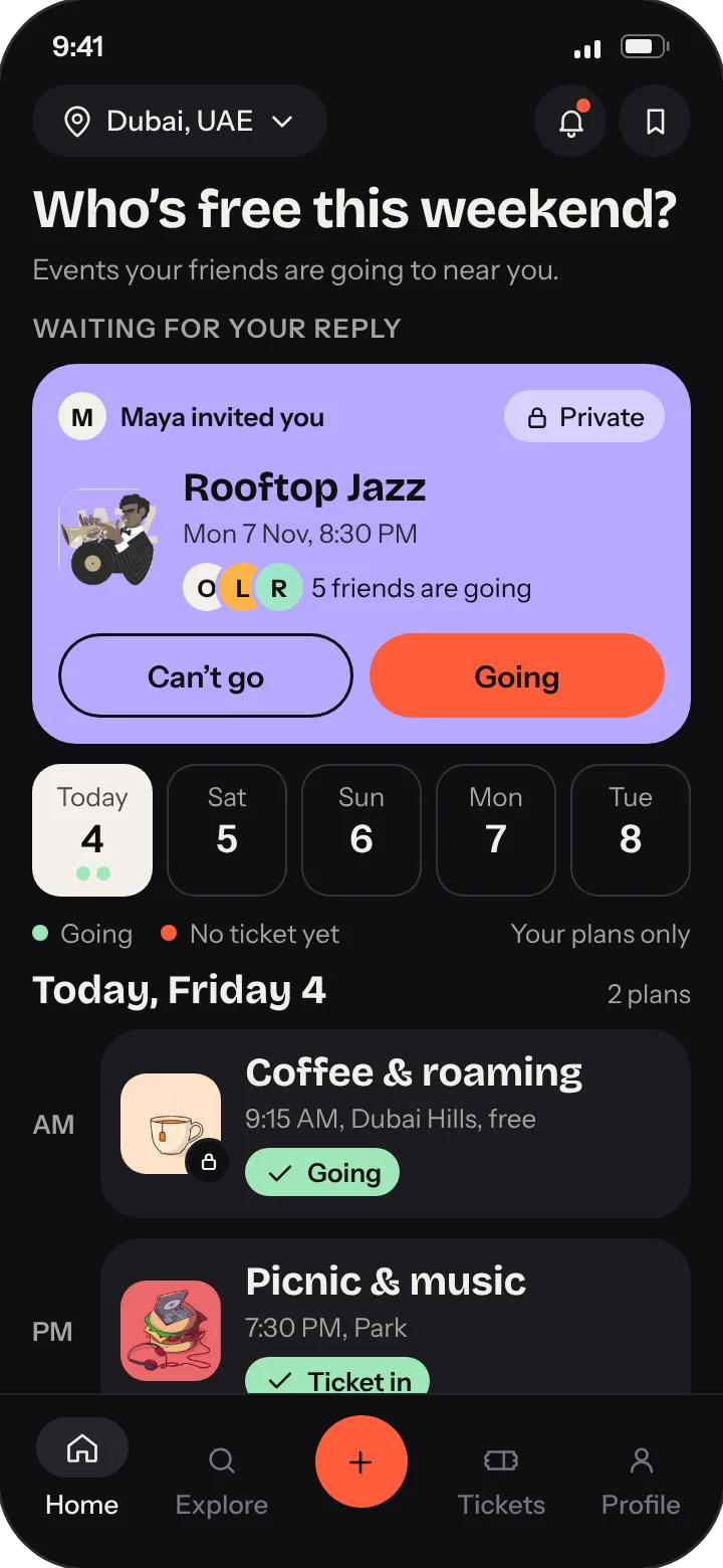
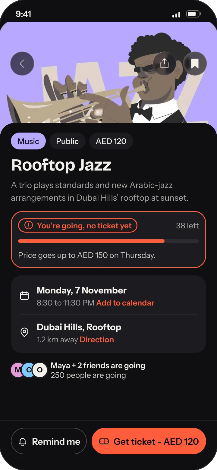
01 - Problem and process
Event apps answer “What’s on?”. People decide on “Who’s going?”.
The brief from Huspy: an app to discover, save, share and create local events. Why Third: home is the first place, work the second, and Third is the place in between.
How I got there: states before screens.
Eight event apps, four built on tickets and four on people. None connects the two.
8 APPSMoved the focus from the event to the people going.
THE QUESTIONThird places are easy to walk into, have regulars, and sit on neutral ground. I designed for all three.
3 PRINCIPLESSix plan states, from Saved to Ticket in, defined before any screen was drawn.
STATES FIRSTSeven flows, including the hard cases: no ticket, sold out, plans changed.
7 FLOWSHigh-fidelity screens for all seven flows, and a prototype.
HIGH-FIDELITYResearch: 8 apps, one gap.
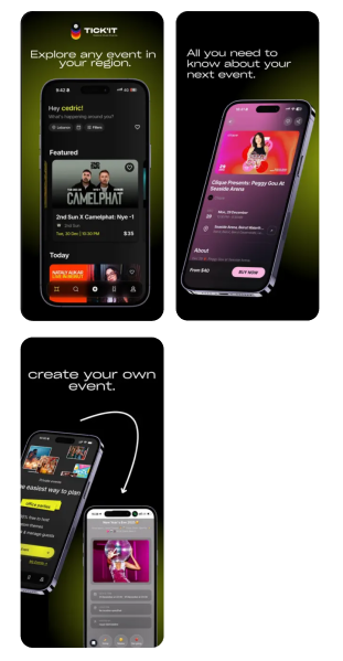
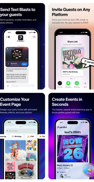
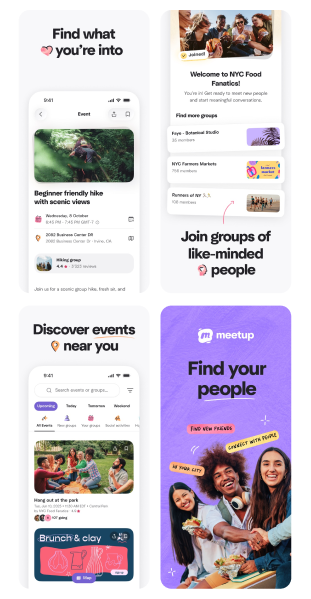
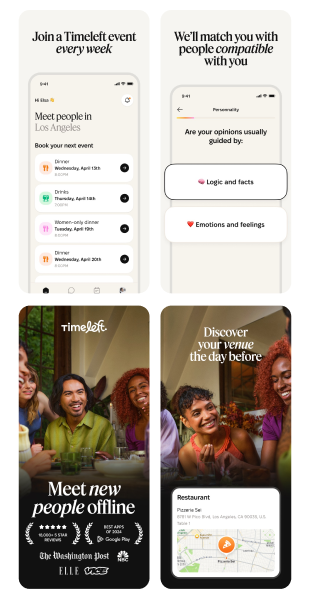
Four ticketing apps and four social apps, from their App Store pages.
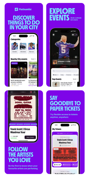
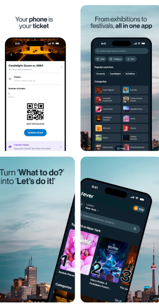
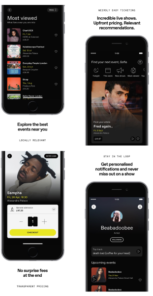
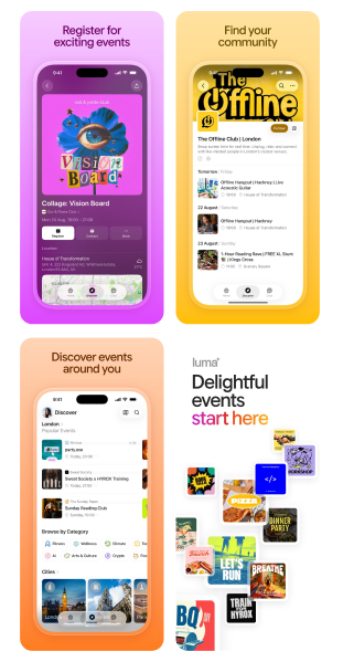
They sell the event. Friends are an extra.
They start with people. Discovery is thin, and tickets live elsewhere.
Third does both, and borrows the best of each: browse by category, prices up front, invites by link, hosting in three steps.
Key decisions, and how I’d check them.
A design challenge, so nothing was tested with users. All content is sample.
What does Home lead with?
Friends’ invites first, then your weekend. Discovery lives in Explore.
Less browsing on the first screen, so Explore needs to be one tap away.
HOW I’D CHECK ITAsk 5 people how they chose their last night out: by who’s going, or by what’s on?
What does the Home calendar show?
Only plans you said Going to, each with its state. Maybes stay in Saved.
Saved needs its own clear entry point, so it sits on Home next to the bell.
HOW I’D CHECK ITTrack how many saves turn into Going, and how often people open Saved from Home.
What if you say Going without a ticket?
Going and Ticket in are different states. The plan stays pinned with stock, price and a reminder.
More states to design, so each one has the same colour, label and place everywhere.
HOW I’D CHECK ITTrack how many Going plans reach Ticket in.
How do discovery tabs work?
One list, All events. For you and By friends are filters on it, each with a count.
Fewer places to explore, but you always know what you’re looking at.
HOW I’D CHECK ITFirst-click test: find an event Maya is going to.
02 - The product
Two jobs: plan it, and find it.
Home and Tickets keep track of your plans. Explore, Saved and Create help you find something and bring people.
{{s.kicker}}
{{s.t1}} {{s.t2}}
{{s.d}}
03 - User flows
Every plan, all the way to the door.
The happy path is easy. The flows that matter come after “Going”: no ticket yet, sold out, a friend dropping out.
04 - Prototype and screens
Tap through it, then see every screen.
A clickable prototype of the main flow, with motion on every state change. Below it, every screen for all seven flows.
The main flow, from invite to the door.
Who’s free this weekend?


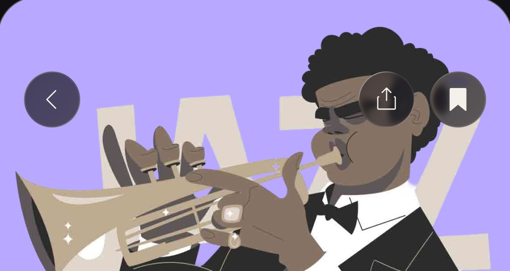
Rooftop Jazz
{{pr.needNote}}
Omar, Lina and Rami can see you’re set.
Your ticket
Dubai Hills, RooftopGeneral admission - 1 person
Show this at the door
Tickets
Explore
Saved
Only you can see these. Tap Going to add one to your plans.
Nothing saved yet. Tap the bookmark on any event in Explore.
Get your ticket
Rooftop Jazz - Mon 7 Nov, 8:30 PMWhen should we remind you?
Or wander off the path: Explore, Saved, Tickets and Remind me all work.
Every screen, flow by flow.
05 - Design system
One colour to act, one to confirm, one per category.
Bricolage Grotesque gives Third its character, from 20 px up. Instrument Sans carries everything functional, never below 13 px.
Orange always means you still need to act. Green always means you’re set.
Orange is the only colour for the main action on a screen.
Screen title - 32
Sheet title - 24
Card title - 20, the smallest display size
Body - Instrument Sans 15
Labels and chips - 13, the minimum